25 years of programming, a look back at the levinology labs brand
The early years
I’ve been programming since I was 13. My sister, convinced she wanted to be a graphic designer, got a copy of Microsoft FrontPage. Within about 30 minutes she realized it wasn’t for her — I swiped it and became enamored immediately.
I spent my teenage years helping friends’ parents, my high school, and small businesses with IT issues and building websites. At 15, I made it official with “Freezerburned Technical Services.”
Fast forward to 2014. I left my nonprofit job and took a long-needed sabbatical. I went to Indonesia. When I came back, I started consulting more earnestly as Levin Technology Solutions — a more professional endeavor.
The pivot
Over the next two years, I moved from IT support and website fixes into building websites for advertising agencies and doing analysis for non-profits. I became the guy called in to build interactive web experiences like PickClickGive’s Picktool and Alaska’s Future PFD simulator.
This was moving me closer to my goal of programming full time. I realized I was no longer in technical solutions — I was a development lab. So I decided to rebrand.
Working with a designer
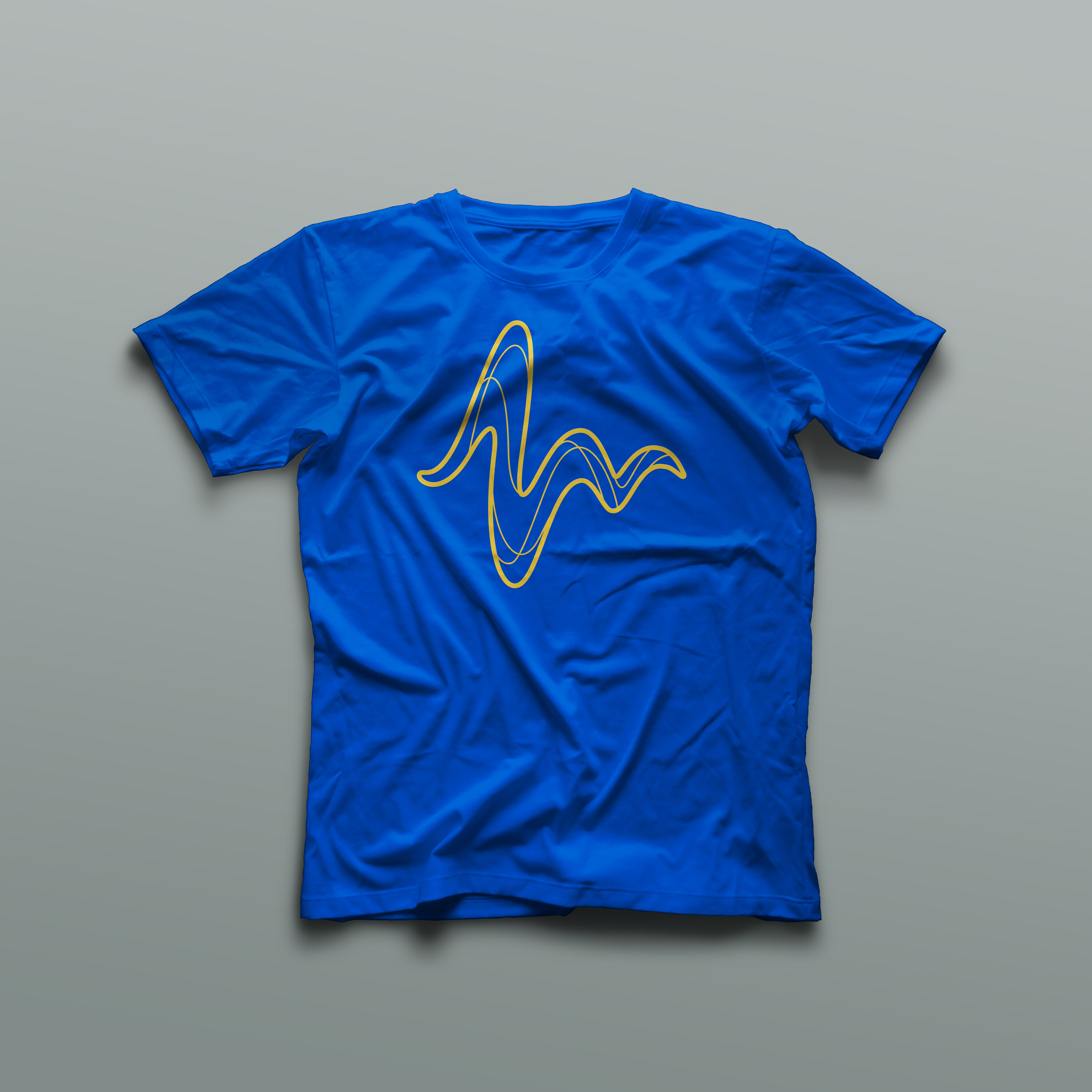
I reached out to Jontue Hollingsworth to help bring the vision to life. The centerpiece became the wave icon — a play on the L in my scribble of a signature, mixed with mountain horizons and telemetry charts. Symbols of my hobbies and passion for data in training and work.
The color palette
I was already using blue, but this update felt clean and fresh. The brand uses three shades that work together as a gradient:
Deep Blue
#0047AB
Bright Blue
#2E86DE
Light Blue
#5DADE2
T-shirt designs
We designed t-shirts exploring different ways to use the branding:
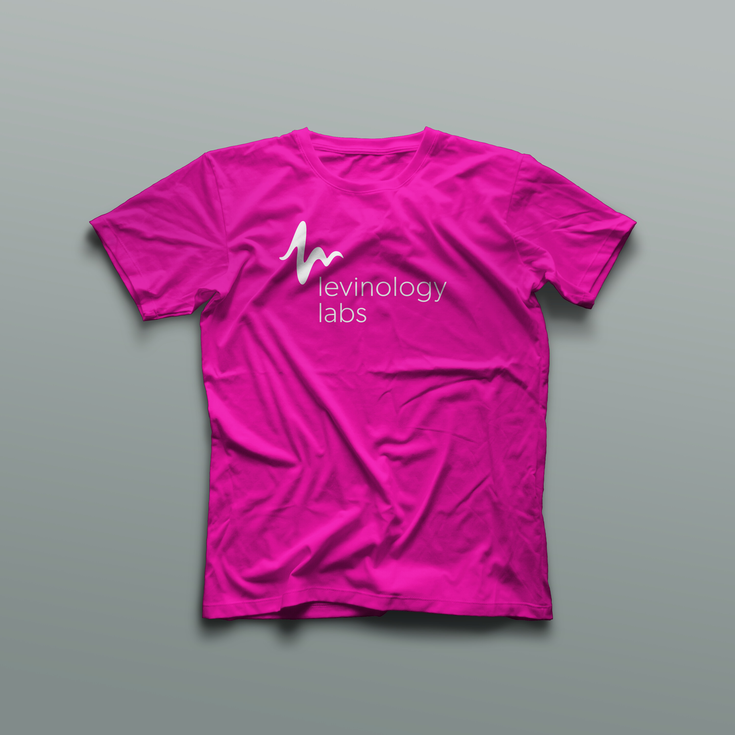
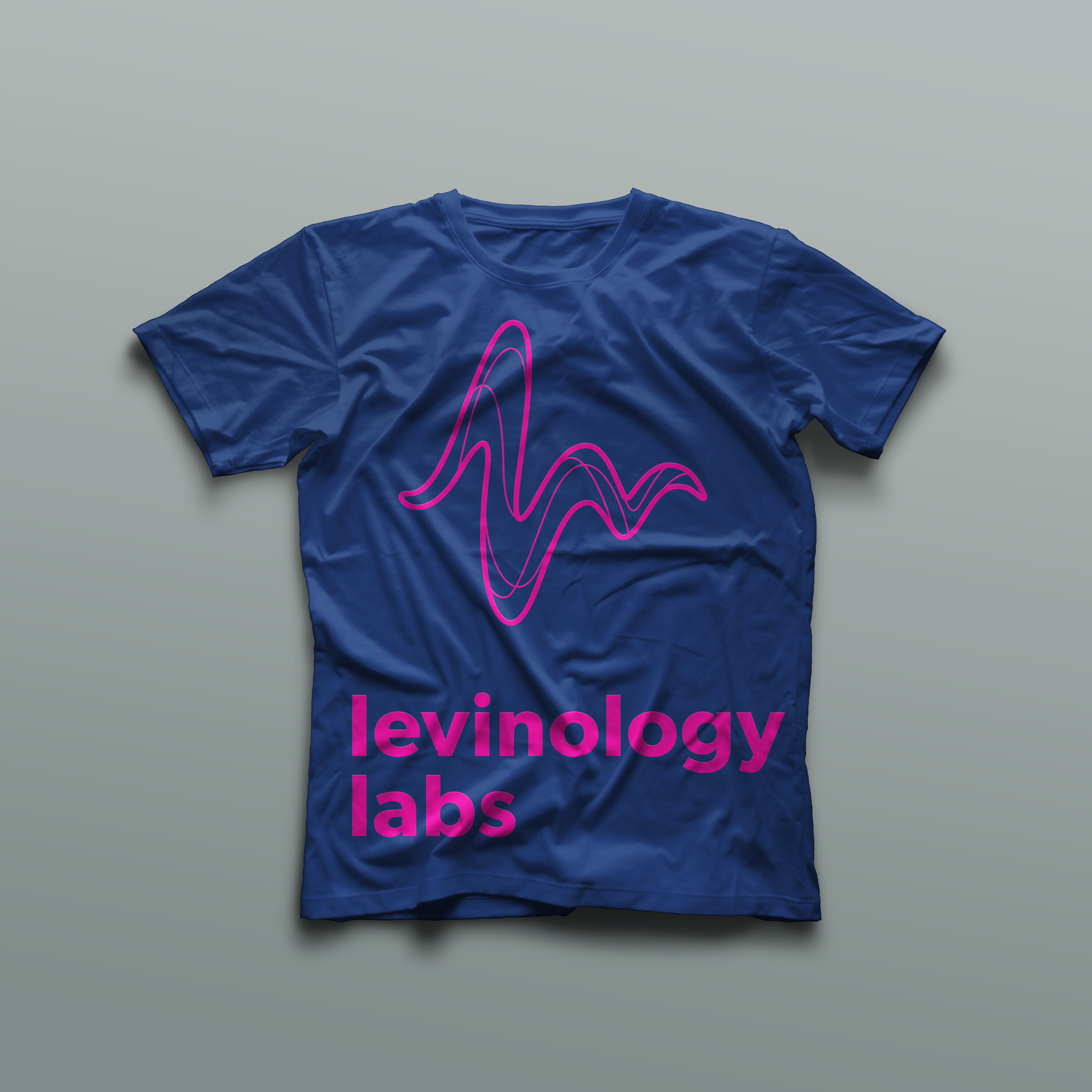
While the navy and hot pink combo didn’t make it into the final brand colors, I did get those shirts made. I gave them to coworking friends and family and incidentally started a swag arms race at the coworking space.
Looking back
The brand served me well. It feels timeless yet modern. The wave icon is distinctive enough to be recognizable but simple enough to work at any size.
These days, I’m not actively engaged in consulting. I’m working full time at Grafana Labs and building Recipinned on the side. But Levinology has taken on a deeper personal meaning. It’s visual identity for my work and my passions.
The wave still captures my core beliefs: continuous learning, peaks and valleys, forward momentum. It’s a reminder that the work evolves but the ethos stays the same.
Branding by Jontue Hollingsworth, who did an awesome job for me when I was just starting out.